
Choosing the Right Size and Style for Video Captions
Did you know that a huge portion of viewers are now watching your videos without sound? Depending on the platform, 50-80% of viewers are watching on mute.
This makes it extremely important to add some form of captions to every video you publish on YouTube, TikTok and your website.
There are a lot of variables when it comes to captions. Are your viewers able to read your subtitles? Are they too small? Do they happen too fast? Is there too much text? Are they in the wrong place?
The reality is that each platform is going to require a different style. So in this post, we’re going to dive into how to format your subtitles so people can easily read and understand them, no matter the platform.
Traditional video content
For video content aimed at YouTube or any traditional horizontal platform, whether it’s for a website or social media, it will follow a pretty standard format. Let’s look at a couple of examples below:


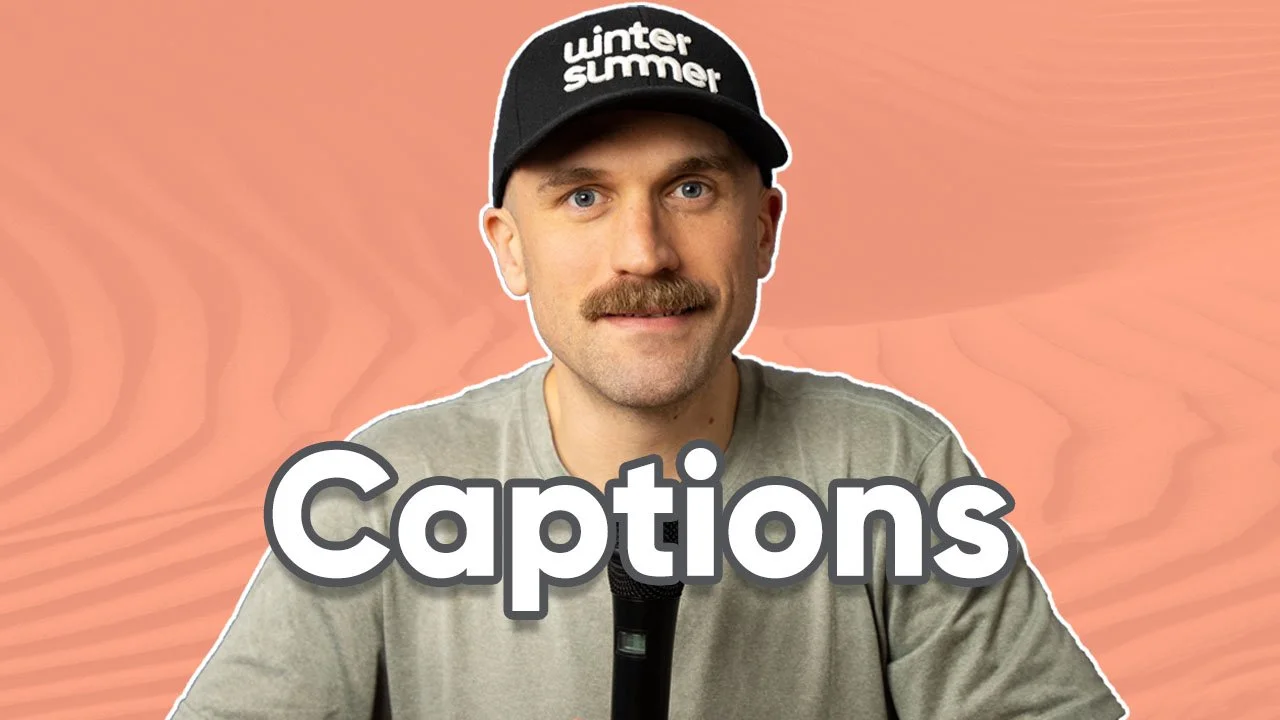
Here is a starting point for creating a standard video caption:
Font: Arial
Colour: White
Size: 55px
Add a subtle drop shadow
Key things to know when creating captions:
Try to limit each sentence to no more than two lines.
Leave some on the left and right so the viewer's eyes don’t have to travel too far across the screen.
Choose a common font like Arial, Helvetica, or Roboto for easy readability.

Styling
There are situations where your video may be bright or contain a lot of light colours so stylizing your captions or adding a background may be necessary so your viewers can easily read them.

Background transparency: 75%

Yellow used: FFD000
Increase the caption size for social media.
I see the mistake often where a company makes a video for their website or YouTube and then later uploads it to Instagram or Linkedin. Since the captions were made to watch on a computer, they can be hard to read when viewed on a phone.

Font size: 55px

Font size: 70px
Short-form vertical content (TikTok, YouTube Shorts, Instagram Reels)
On short-form content platforms, the trend of captions has taken on a slightly different look. Since our phones are vertical, we are limited to how many words we can show at a time. So what you’ll see is the captions that are shorter and that appear for less time. Here are a few examples:

Key things to know when creating short-form captions
Make sure the captions don’t cover any descriptions or icons that appear on the platform.
Minimize the distance between the focus point and the captions. If the focus point of the video is someone talking, keep the captions in the middle of the screen or as close as you can to the speaker.
Aim for 2-4 words at a time.
Make sure the text appears at the same moment the words are spoken.

Styling
When it comes to the look of captions on short-form platforms, you will see a lot more variety and creativity than you would in traditional video content such as YouTube.

A stroke is added around the words

It’s highlighting the current word

Yellow, capitalized, bold and italic
The biggest takeaway is to make your captions bigger and to add a stroke. A stroke is a padding around the words that is of a different colour. The viewer is staring at a small screen, so we need to do whatever we can to make them more easily readable. You can also make your videos recognizable to your audience by consistently using the same colours and fonts.
Keep it simple
If you want to keep things simple, like I do, then make those captions directly on the platform you are uploading. TikTok, YouTube, and Instagram all have the ability to automatically transcribe, create, and stylize captions on your videos. If you want a little more customization for short-form content, then consider using a platform like Capcut, which will give you a little more control over the final result.